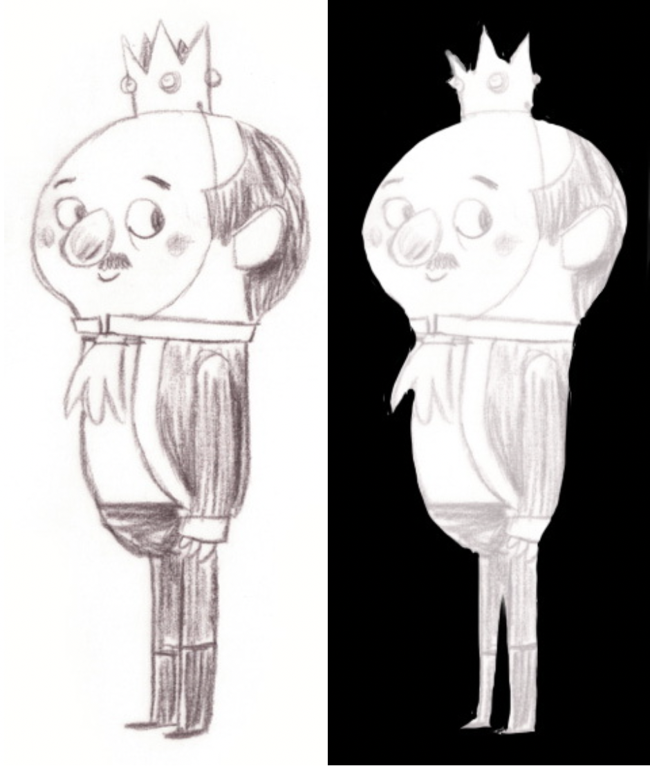
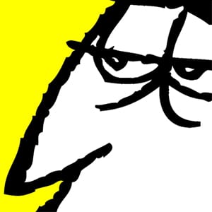
To help aspiring animation artists who are designing characters for the APW Character Design Contest, we asked animation professionals – former APW students and friends of APW working in the animation biz to add their character design pointers in the Pro-Tips series. Pro-Tip #5 comes from APW grad, former APW instructor and present Toronto story artist Myke Bakich. Having worked on films with Netflix, Sony Pictures Animation, Aardman, and Marvel Studios, Myke offers his advice:
Contrast is Key
Contrast, in my opinion is the most important element in character design. Contrast means the difference between two or more things, whether it be with space, shape, tone, colour, or rhythm. Let’s look at an example to help me explain my point. This is a design from German character designer Uwe Heidschotter.

